Logo & branding
Professional logo design
A logo is one of the most important elements. The logo accurately reflects the concept of business, customer promise, services and offers, quality, reliability, and everything that distinguishes you from others. To begin with, positioning or developing the brand. Think of it as an integral section of your company, through which customers recognize your brand. The logo shows the individuality and specificity of entrepreneurship. This is the basis of the brand’s marketing strategy, which needs to be carefully considered in order to reach the consumer’s imagination. The logotype should be not only unique and easy to understand, but it also should effectively transfer the value of your brand. An example of a strong brand is the Nike logo, a simple sign that is easy to understand and memorize. Features of a properly selected logo:
Features of a properly selected logo:
- unique and easy to identify;
- colors and images related to the brand of your company;
- legible fonts;
- synchronization with the company’s name and the correct information transmitting;
- easy to remember and make a good impression;
- compatible for using on different platforms.
Types of logos
Many different logos have already been invented. But, conditionally, they can be attributed to 5 varieties – symbolic, combined, text, emblems and alphanumeric.
- Symbolic logos are in the form of a letter or, more often, graphic symbols. The image must be relevant to the nature of the company or make sense.
- Text logos are logos consisting of letters only. The work of the designer consists of a unique typographical treatment of the selected or made from the scratch font or combination of fonts.
- Combined logos use the visual form to convey the concept of the company.
- Emblems are more complex combinations of graphic elements and text.
- Alphanumeric logos are the type that is most common and surrounds us everywhere. It reflects the exact spelling of the name of the company or brand, and processing in the printing house usually preserves the uniqueness of this name.
Principles of logo design
Design is the hardest part of creating a company’s logo. It must be original, represent the uniqueness of your business and stand out from the crowd. We suggest you consider the following step-by-step instructions for creating a logo:
- Market research. Firstly, you should conduct a study of the industry, target audience, competitors and logo designs that have been used previously. Decide what message should be transmitted through your logo, study current trends and customer preferences.
- Research logo design. When you create a logo then this process requires focused and great creative approach. Originality and versatility are crucial to a logo succeeding on the market. It is important that you explore good and high-quality logos for inspiration that will help you get started.
- Initial design work. After you did the research, got inspired and understood the meaning you need to convey, sit down with a pen and paper to write down ideas, draw initial sketches and visualize the concept.
- Choose the right font. It should be simple, legible, it also needs to be synchronized with the logo images. Try not to overdo it when changing the font or creating a new one. Consider the amount of readable text, available space, colors, etc. Creating a new font, learn about font licensing issues and the security process.
- Image selection. When choosing an image, pay attention to its size and position, attitude and do not forget about your target audience.
- Tone and color. The selected colors shouldn’t be too bright. They should match the company’s brand. Remember that logos should look good in both color and black and white. Think carefully about tones and contrasting backgrounds.
- Good slogans. The logo also includes a good slogan that conveys the brand message of the company. Slogans should be simple and go hand in hand with the overall logo design.
- Compatibility with social networks. Make sure your logo design matches the formats of various social networks.
Creating an effective logo design is the first step in brand development. With a powerful logo in your hands, you can create an integrated branding strategy.
What is a brand book? Basis and examples
A brand book is an official corporate document that explains the brand identity and represents its standards. It contains all the rules and functions of the brand, to provide a consistent marketing message for all media platforms and geographic locations of the business.
Brandbook is not just an important component of the image in visual terms. A brand book, first of all, is a set of missions, aspirations, philosophies, and values that are officially documented. It is the main tool for building any communication scenarios with the brand. The development of such a document helps the “stakeholders” to guide on the use of a unique style and to strengthen the positive reputation among target customers.
Brandbook describes:
- description of the brand;
- the main platform of the brand;
- product prerogatives;
- customer values;
- essence and Brand Essence;
- brand mission;
- awareness of future prospects;
- points of a creative approach to verbal and visual identity.
Brandbook structure
There are 3 main sections in the brand book structure:
- About the brand
Often it includes the mission of the brand, the importance of the target audience.
This section can be briefly or long described, depending on your intentions and how scrupulous you are in brand guidelines analysis.
- Visual recommendations.
- Logo: color, location, variations, size and proportions, examples of unsuccessful use of the logo;
- Brand: color, where and when to use it;
- Slogan: where it should be displayed;
- Colors: main brand colors, as well as flowing colors;
- Typography: corporate fonts for headings and body text;
- Photograph: concept photography, recommendations, tips;
- Other graphics: icons, patterns, textures.
- Rules of communication.
- Language: multilingual, mono or several languages;
- Grammar and formatting: abbreviations, numbers, capital letters, tenses, and names;
- Readability: complex or simple sentence constructions;
- Style: techno / non-technical; formal / slang;
- Voice tone: logical / emotional; suspended serious / humorous;
- Email: email structure email signature email mail;
- Style Guide: guidelines, rules-based formatting, and blog structure;
- Social media: goal, time, types of notifications for each social channel.
Brandbook Algorithm
It must be remembered that the same standard for creating a brand book hasn’t been invented yet. Of course, citing any brand as an example, it will contain the main points: the logo itself, its slogan, its own colors and font styles. The rest is developed for a brand by a need, its concept and size depend on personal unique brand features. Making a brand book is quite a laborious process that requires a special care and patience:
Stage 1: Company Audit.
Description of the ideological component of the brand – the mission, values, objectives, corporate culture, goals.
Stage 2: Analysis of the brand platform and the development of standards for the use of its elements.
Rules for creating a logo, a unique sign or colors, fonts, rules for creating layouts and the development of outdoor advertising concepts.
Stage 3: Development of the legal component.
Regulation of copyright and related rights, rights to patented trademarks.
Also, an additional step in creating a brand book is the guideline.
No matter how sophisticated your marketing department is, there are many misunderstandings about the guideline; the value it provides and the role it plays in defining, maintaining and developing a brand.
The problem is largely related to semantics. Brand Guide, Brand Standards Guide, Branding Guide, Style Guide, Brand Book, Brand Identification Guide, can be considered synonymous or completely different definitions depending on which “brand expert you are dealing with.
In addition to semantics, these terms represent the same idea. And in order to follow the rules of your brand properly indeed, first of all you need to understand what these terms represent themselves, and why they are important.
What is guideline?
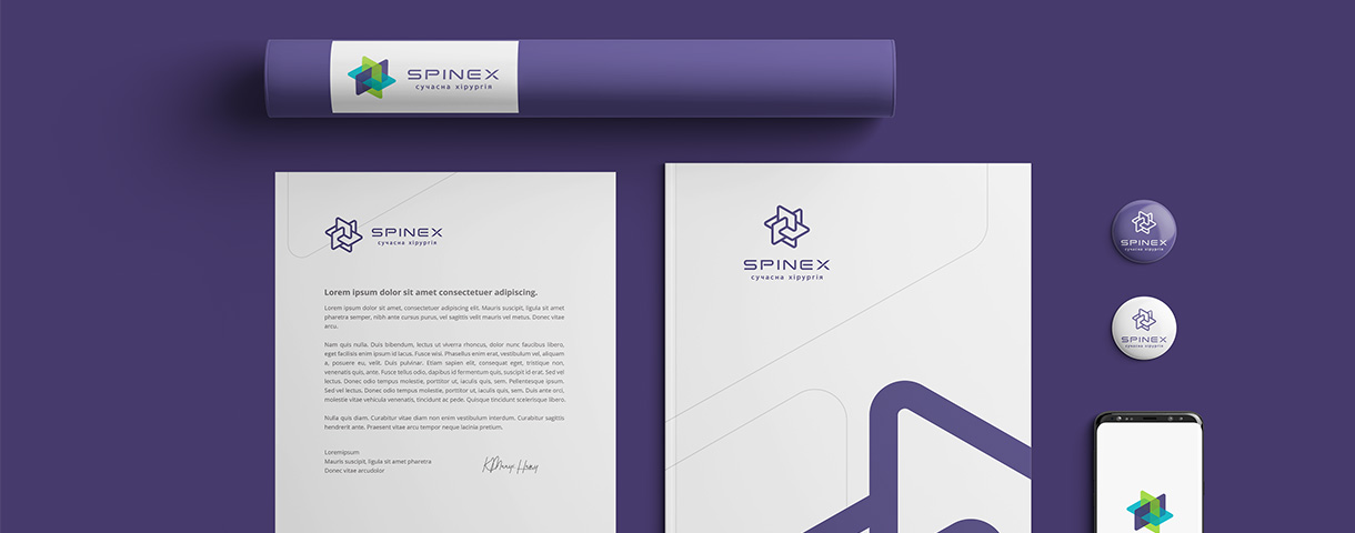
The guideline is a guide to the implementation of the company’s visual identity elements: logo, color spectrum, custom fonts, layout formats, style components, icons, patterns, backgrounds, photo style, etc. for the contractor.
A guideline is a tool designed to ensure the consistency and flexibility of your brand. Most global companies use a brand identity guideline as a resource that every employee can use to figure out how to represent their brand.
Guideline content
A well-designed guideline includes a sufficiently large amount of information to ensure the integrity of the individual style when using any medium. The guideline should be flexible enough for designers to be creative, but tough enough for your brand to be easily recognizable. Consistency is the key, especially if you need a brand for spreading across multiple media platforms. Generally, all information from the guideline can be divided into the following categories:
- Logo design. The first thing that is important to reflect on the brand’s guideline is the logo. These should be basic: shape and design, which you expect to see in 90% of cases;
- Logo options. Your logo options are other possible designs that can be used for your brand. Make sure you have a finished version. Option without text or without a logo, and so on;
- Inverted and monochrome logo. Of course, your logo, by and large, must exist in the main color palette. But then you need to show it in reverse order, in a different color scheme, and often, completely black;
- Company colors. Your company colors should be presented in two copies: the main colors of the brand and secondary company colors;
- Brand image. A photograph or illustration is able to play a key role in identifying your brand. It is essential to have a consistent photographic or illustrative style from the very beginning. This section of the guidelines usually indicates the selections of appropriate and inappropriate images. It will focus mainly on light, composition and subject matter;
- Active in social networks. The last thing that is included in the basic principles of the guideline is the social networks resources. Consistency helps your brand become recognizable, especially on high-profile social networks.
Passport of corporate identity standards
For whom and what is the passport of standards required? There are two versions. The first is to be used inside the office, spreading among employees so that they can grasp the basics of the identity of a personal company, and try to “conform to the image” (for example, when working with customers or evaluating the work of contractors). The second is for transfer to counterparties (most often they are advertising agencies) so that they do not spoil the stylistic foundations of the company with their uniqueness.
There are other types of passport standards:
- execution of official documents and souvenirs;
- design of communications in the advertising field;
- interior trim, exterior;
- guidelines for the repair of houses and other premises;
- katguide – contains guidelines for website layout and design;
- matchbook – rules of merchandising.
