Online Store Design. What to Pay Attention to
 684
684

Design of an online store is one of the most popular orders in our studio.
All elements in such a project should pursue one goal – the sale of a product or service.
The website of an online store can also be complicated by the presence of such options as a discount calculator, calculation of payment in installments.
So, what you need to pay attention to in the design of online stores:
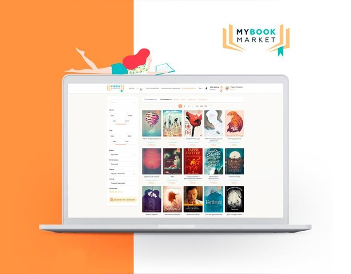
Properly designed header (top of the site).
It must contain:
logo, name of the company, search, contacts, basket, callback.
Initially, the visitor sees this part of the site.
The design of this block carries an important design load.
The brand name is also located in this part – it is customary for the user to see it on the left side.
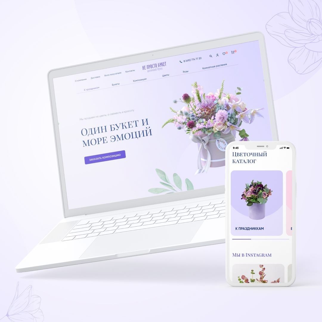
Main content. (Promo part design)
The promo block is located under the header.
It is intended for advertising, notifications about promotions and discounts.
As a rule, the promo block includes the ability to switch slides.
The logical arrangement of information in an online store plays a huge role in its perception.
For example, studies on the impact of visual advertising on consumers suggest that potential customers remember best the upper left corner of a screen or image, and perhaps this is where the main banner with information about promotions should be placed.
In the middle of the page we place enticing information, selling articles and other elements that attract attention – popular products, discounts, new items.
Design features of the footer (the bottom bar of your website).
Here you should definitely place buttons such as:
delivery, payment, feedback, links to pages in the social. networks, icons of possible payment methods.
ontrasting text with clear headings is well perceived In the footer. The client completes familiarization with the site in this part of the page.
Contrasting text with clear headings is well perceived in the footer. The client completes acquaintance with the site in this part of the page.
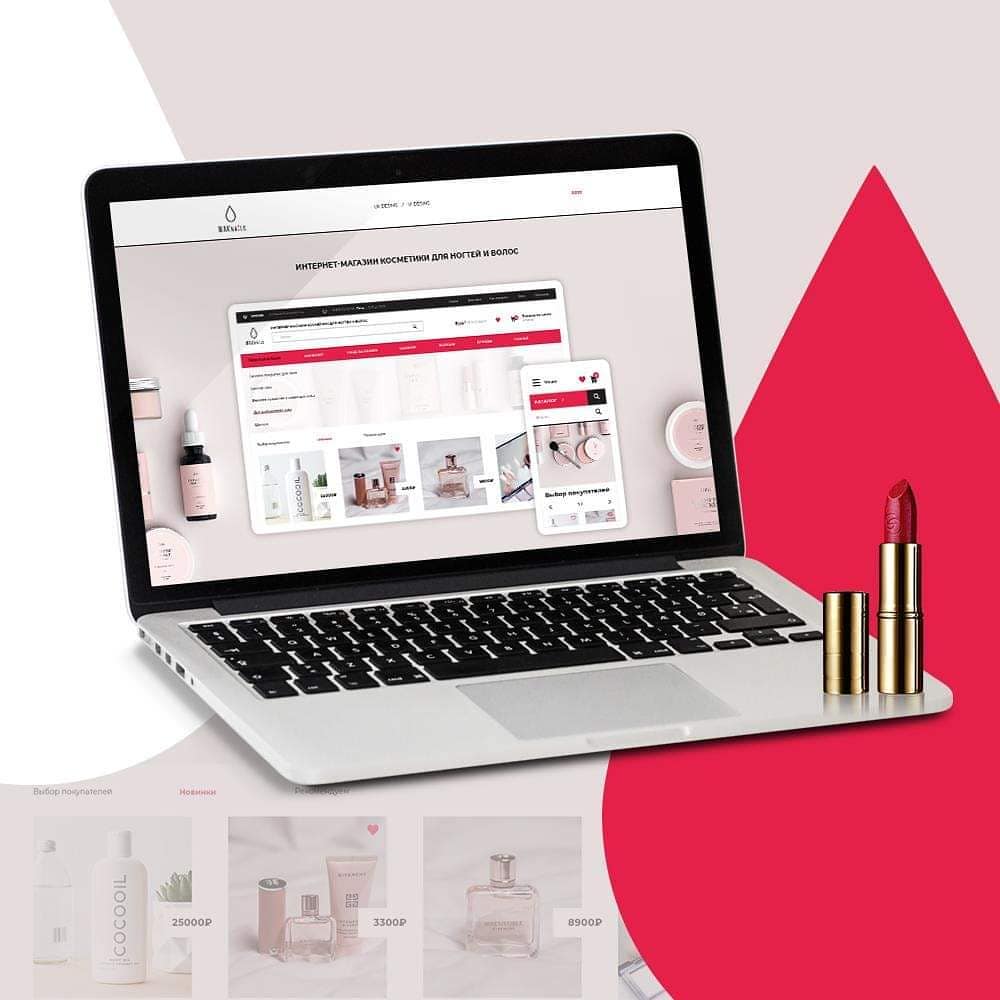
Shopping cart design.
It should be as concise as possible so as not to distract a person from the final purchase.
Going to the shopping cart is the final stage of the purchase. So do not post unnecessary items, promotions and special offers here.
To place here links to related products and accessories would be the right decision.
Be sure to include a brief description of the product and information about the current price.
Product page design.
A certain sequence of placement of goods is very important here.
The AIDA system (Attention – Interest – Desire – Action) can help you with this,
its effectiveness is described in many works on the psychology of buyers.
Page components should be clear, understandable, and positioned according to what the potential customer is thinking about the product.
“What is it? — What does it look like? – What price? – What are the characteristics? What do others think about it?”
The page should be spacious, the main elements should stand out.
The structure is built using separate blocks of information in such a way that would not confuse the user.
We select objects: product name, photo, price, “Buy” button.
First of all, the client’s attention should be attracted to the selected elements.
Further product description, specifications, rating table, delivery.
With the seeming abundance of information, it should be compressed to a comfortable for the buyer size.
The quality of the product image determines the speed of the decision to purchase.
Even with a large number of photos, you cannot send the user to another page of the resource to see them.
The design is also minimalistic – nothing should distract potential buyers from choosing goods.

It is not recommended to use more than 3 colors
in the design of online stores and websites.
More colors are allowed only for advertising banners and product photos.
Bright and toxic colors are not welcome – they cause negative reactions and a desire to leave the site as soon as possible.
Soft calm tones evoke calmness and generate confidence.
And, in turn, a calm, positive attitude of a potential client is the most important step to making a purchase.
Hope that the information was interesting for you, and a high-quality and efficient website of the online store you can order in our studio!