Typography in Movies
 4211
4211

If you’re a fan of typography, you’re sure to love seeing it on the big screen. From being featured in trailers to staring back at us on movie posters, typography in movies captivates our attention and plays a key role in convincing us that we want to see a film.
Below is a list of 10 movies that use great typography.
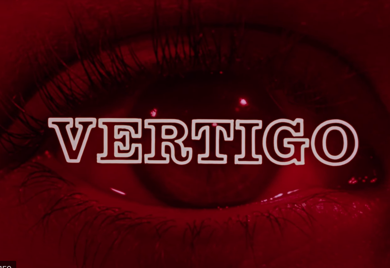
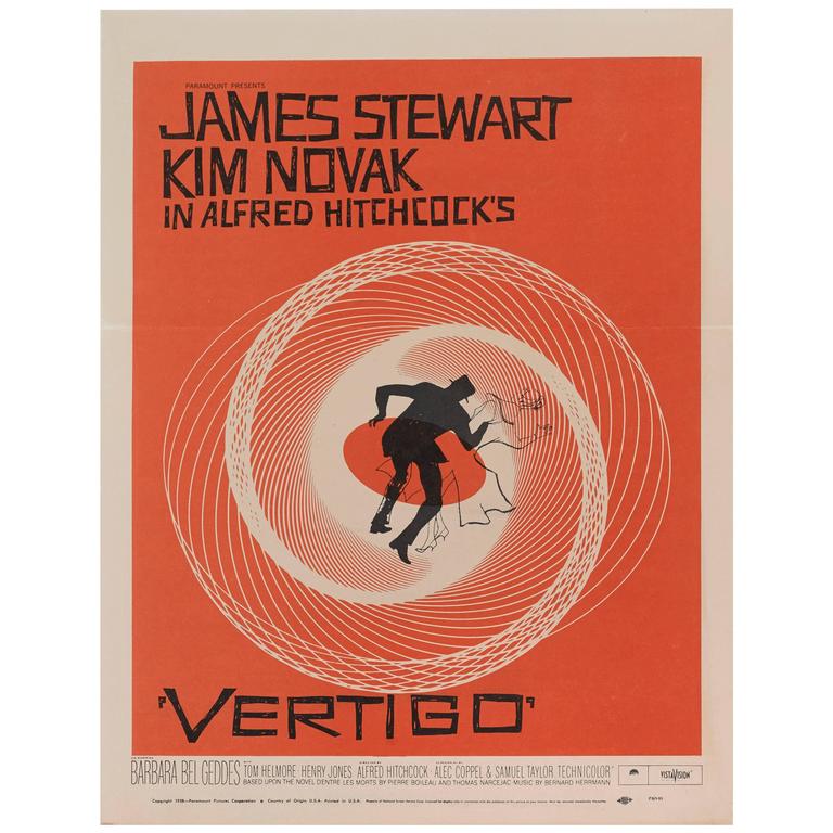
1.Vertigo (1958)
Legendary designer Saul Bass created the look of the title for this stunning Alfred Hitchcock film. Here Bass achieves the perfect harmony between the font and the frames behind it, which, however, is also inherent in other films with his design.
These titles laid the foundation for a new school of film title and title design. The image of the spiral was created by John Whitney, a computer animation pioneer, under the direction of Bass.
Primary fonts: Claredon and News Gothic.
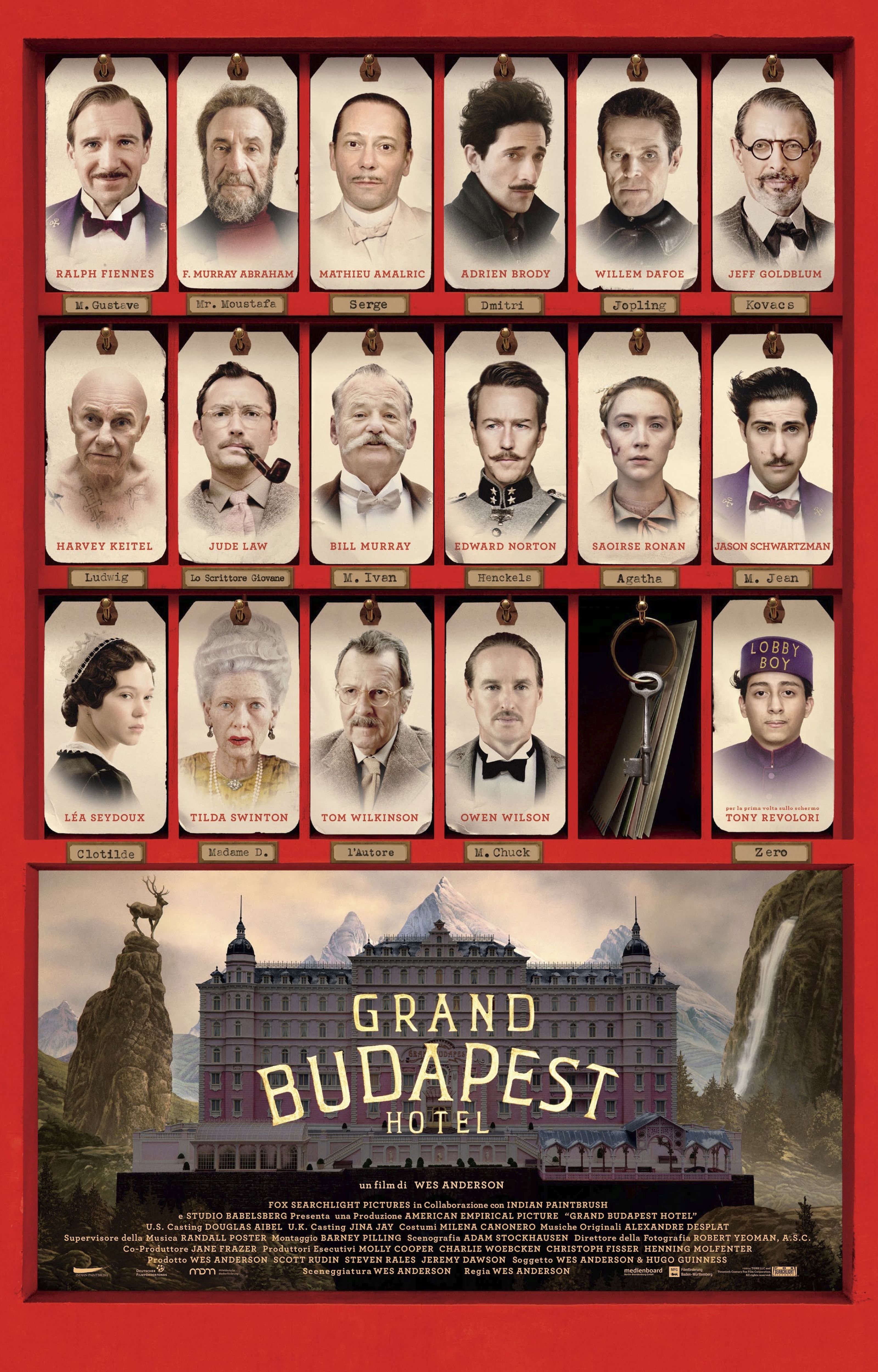
2. Grand Budapest Hotel (2014)
Wes Anderson received a lot of international acclaim for this film, which is also unique in its huge design work, including on the typography.
Posters, as well as packaging, stamps, passports, newspapers, menus and many other props were designed by the talented Annie Atkins.
Primary font: Archer.
Other fonts used in the film include Beaufort, FF Din, Old English, Münchner Feature, Trajan, Russian and Cheltenham.
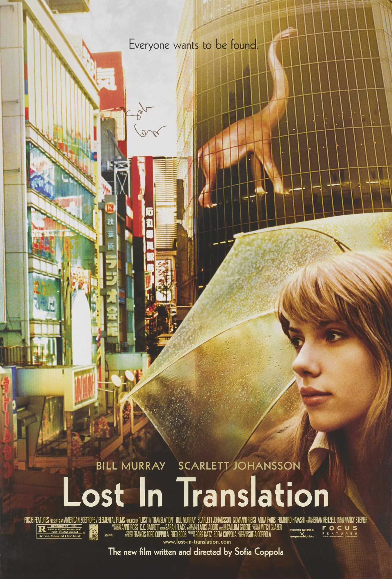
3. Lost in Translation (2003)
In Sofia Coppola’s timeless comedy-drama, Corey Holmes used a simple and seemingly ordinary font for the poster and promotional material, which was very much in keeping with the introspective experiences of the characters during their stay in Japan.
Primary font: Kable.
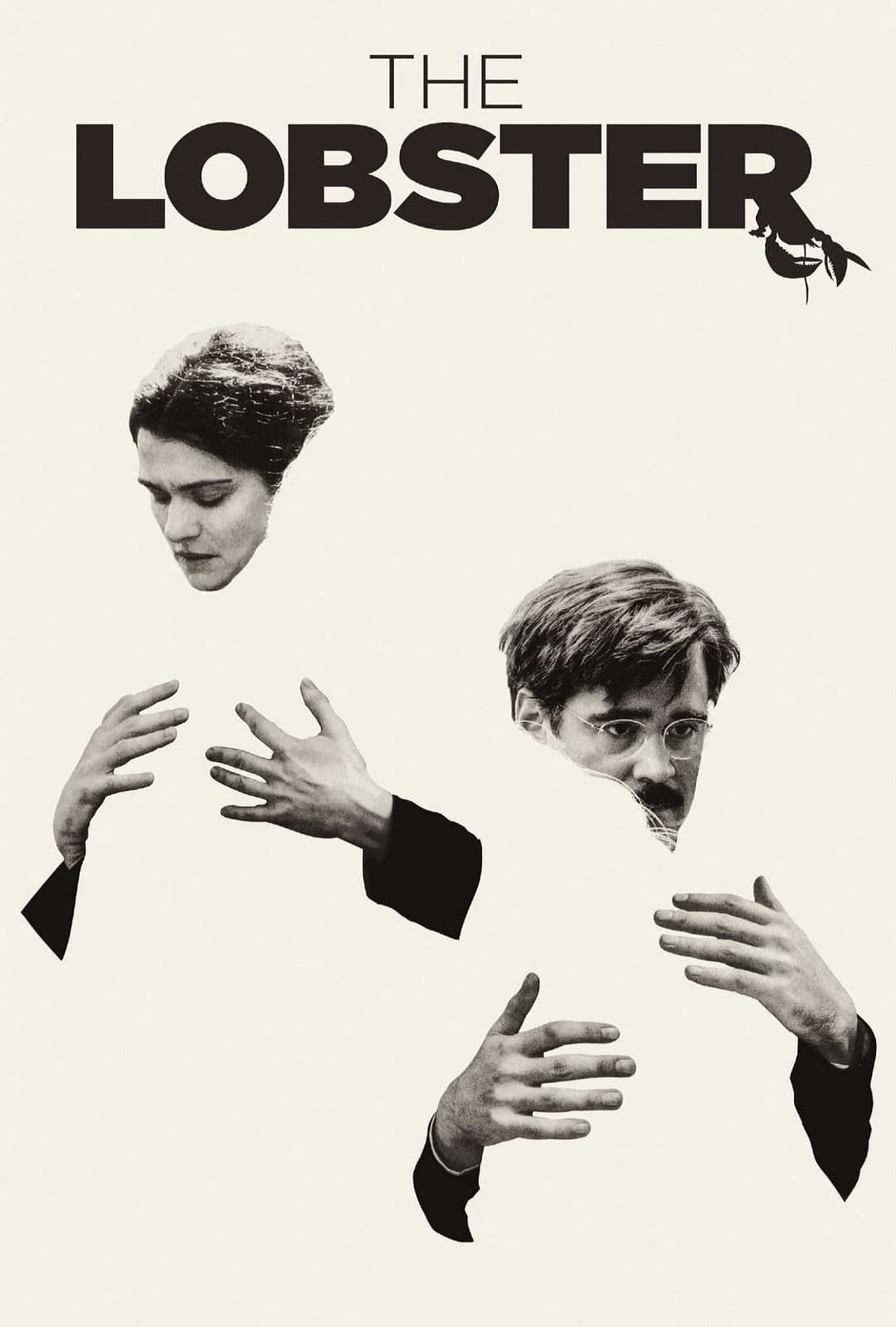
4. Lobster (2015)
This acclaimed genius and bizarre film by Yorgos Lanthimos was promoted with minimalist posters by Vassilis Marmatakis.
Main font: Avenir Next.
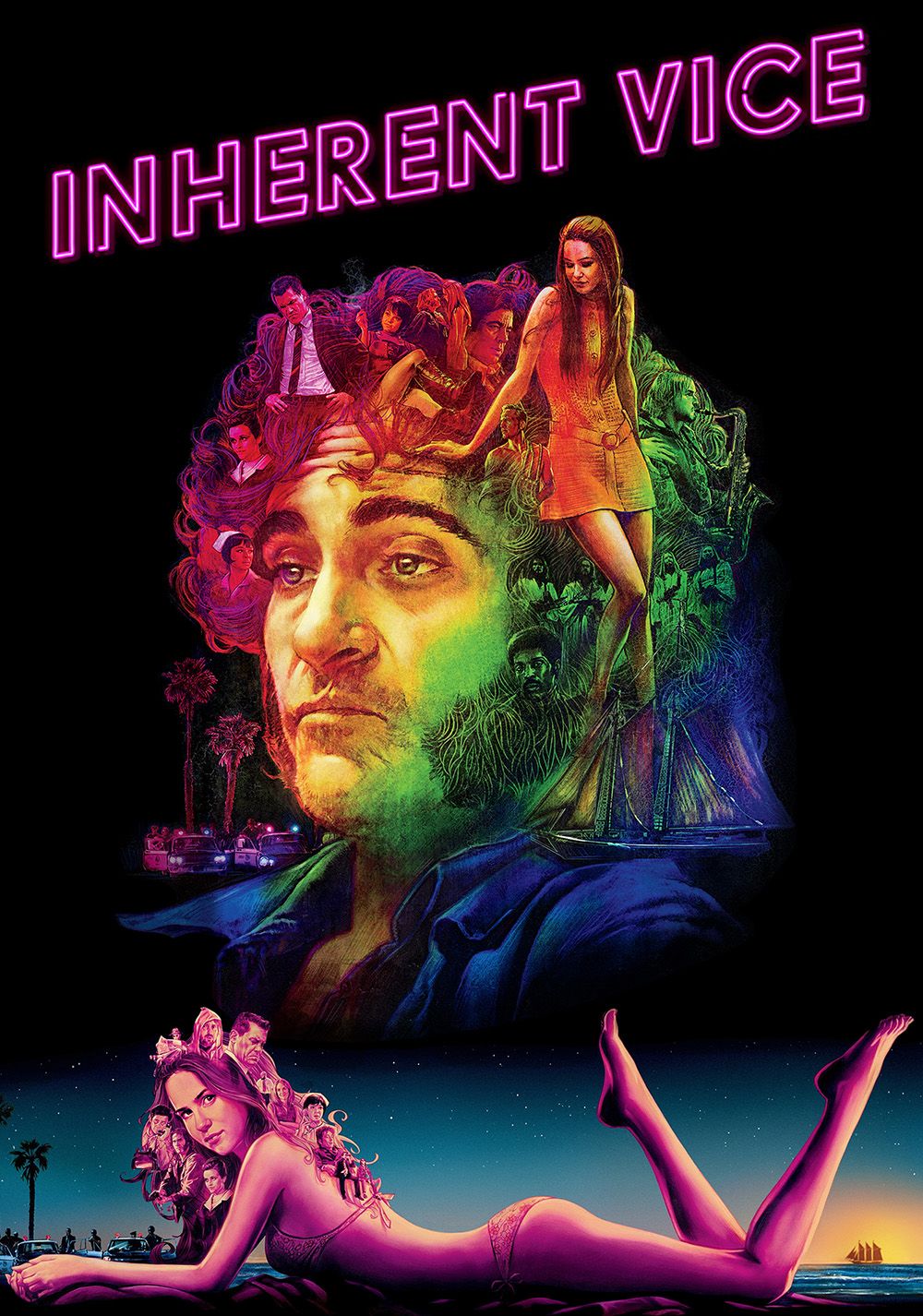
5. Inherent Vice (2014)
The film by Paul Thomas Anderson is particularly notable for its promotional posters and credits.
Neon colors instantly transport us to the atmosphere of Los Angeles in the 70s.
Designed by BLT Communications and designers Tal Goretzky, Darshan Zenith, Darren Haggar, Dustin Stanton and Stephen Chorney.
Main fonts: Drescher Grotesk, Rolling Pen, Ne10, Sneaker Script, ITC Serif Gothic.
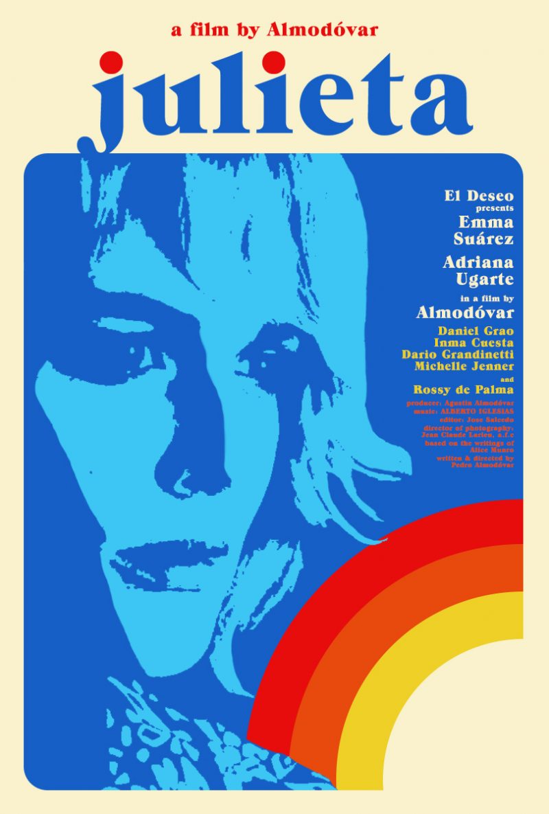
6. Julieta (2016)
This heart-rendering film from Pedro Almodóvar was nominated for several international awards.
As is often the case in his work, Almodóvar submerges us into a predominantly female universe that presents a fresh take on motherhood.
The posters and credits were designed by the Barfutura agency.
Main Typeface: ITC Grouch.
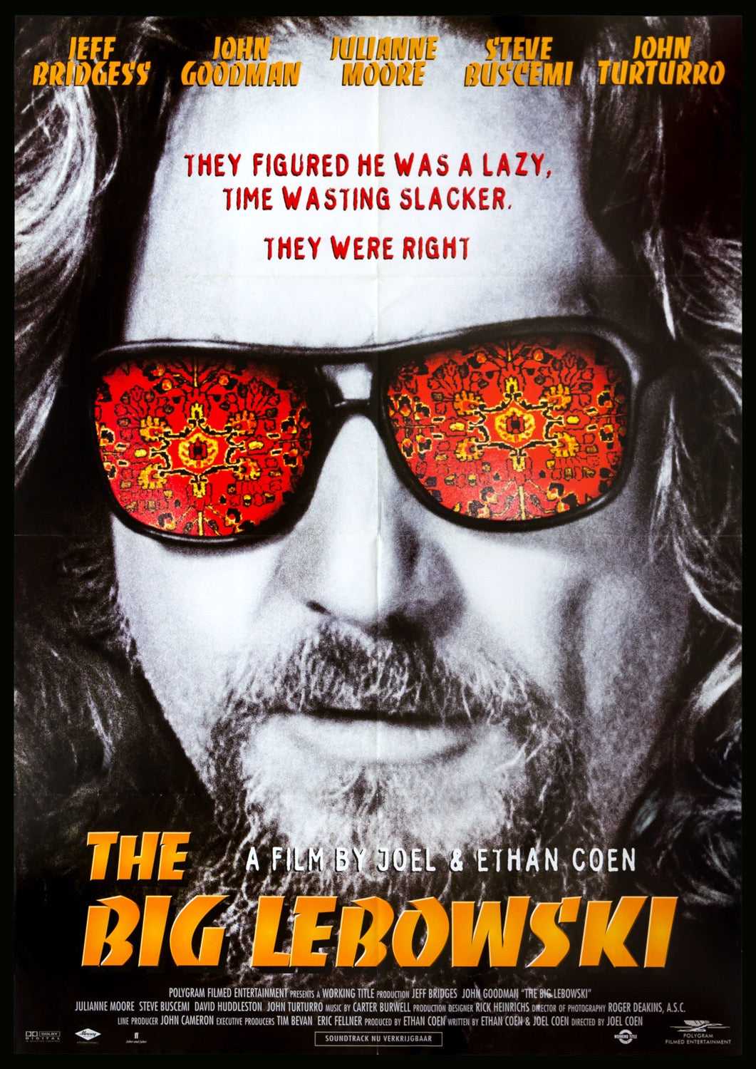
7. The Big Lebowski (1998)
This film by the Coen brothers brought us some of the most celebrated characters and quotes in film history.
The movie is also praised for its incredible opening and closing credits, which channel the tone of the film and reference some of the most important sequences. The designers who worked on this film were Big Film Design and Randall Balsmeyer.
Main Typefaces: Magneto, Mesquite, Monoline Script, Berthold Block.
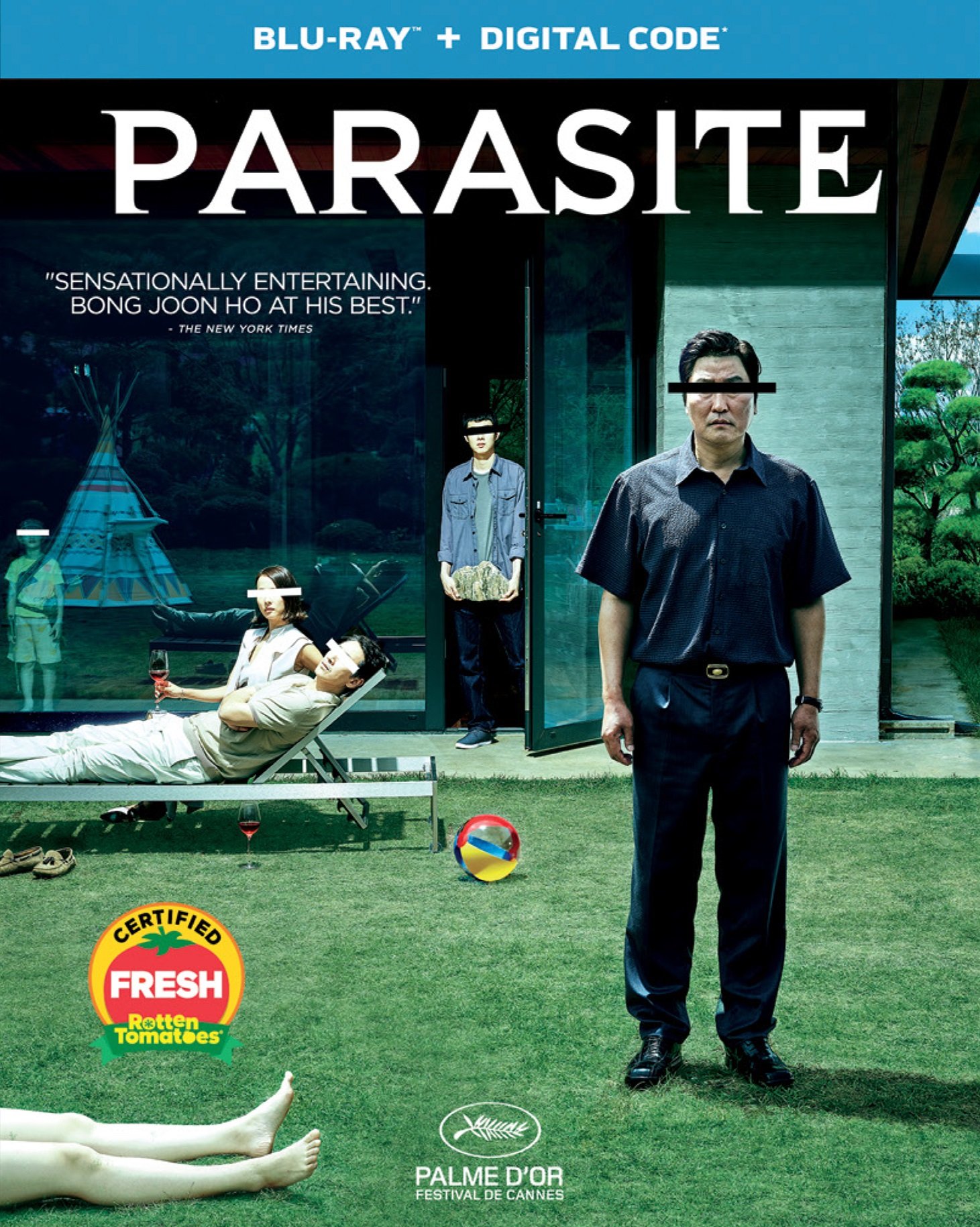
8. Parasite (2019)
Without a doubt the most talk-about film of 2019, Parasite was written and directed by Bon Joon-ho.
The credits and posters use a modest and classic design style, featuring timeless fonts. The designer is uncredited.
Main Typefaces: Gotham, Garamond, LT Didot.
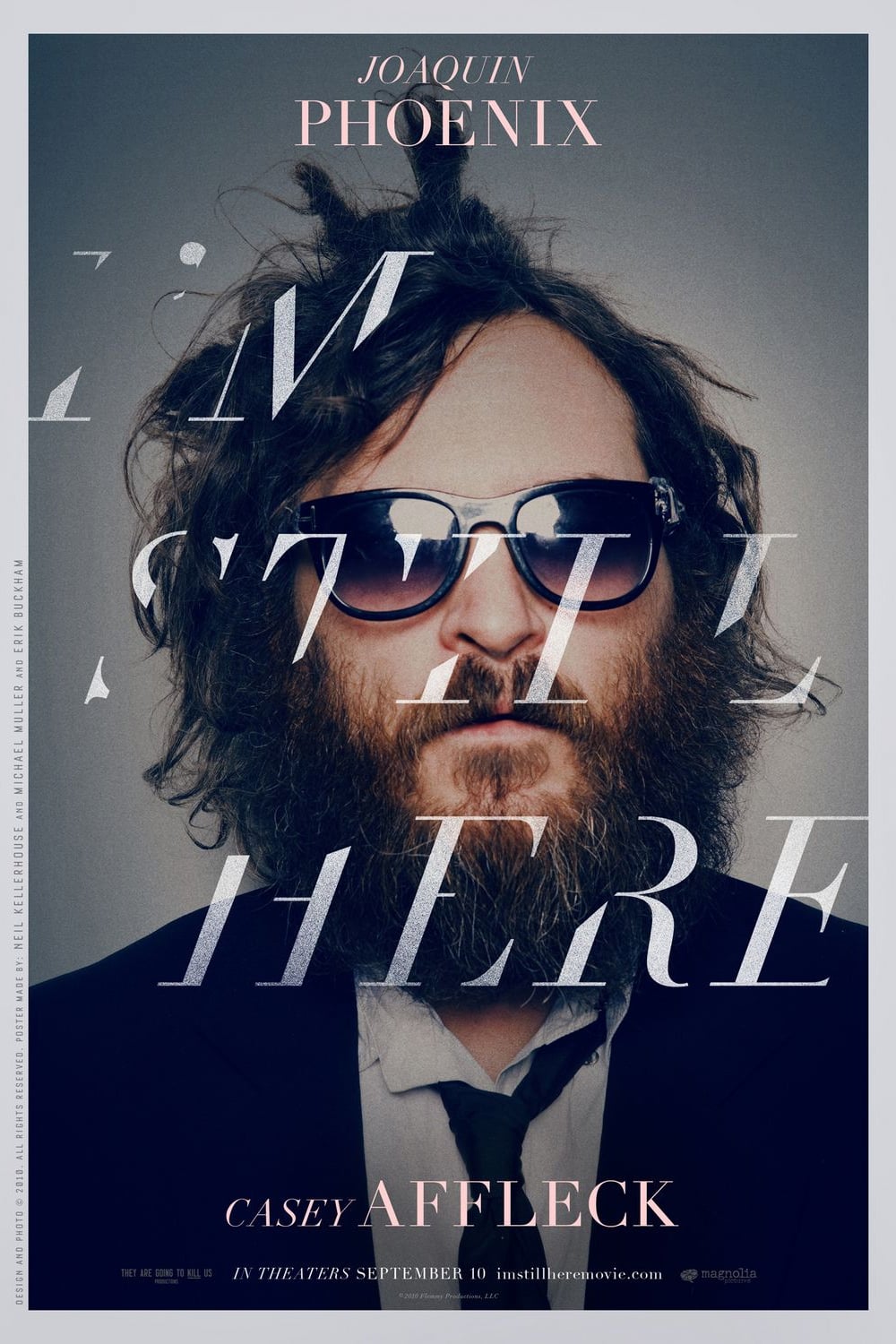
9. I’m Still Here (2010)
This mockumentary directed by Casey Affleck, in which Joaquin Phoenix announces he is retiring from acting, fascinated filmgoers.
The poster also made its mark on popular culture, and we saw lots of projects try to recreate the sharp italics. The poster (and the titles) were created by Neil Kellerhouse, Michael Muller, and Erik Buckham.
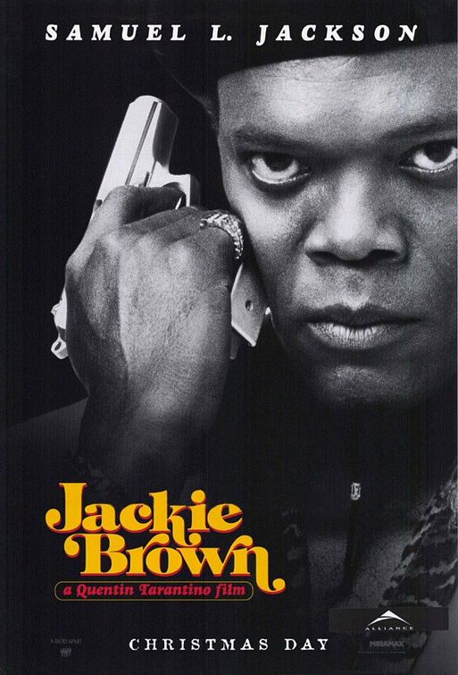
10. Jackie Brown (1997)
This film from Quentin Tarantino pays homage to the 70s, which is why the typography also transports you to a funky universe.
Pacific Title and Mirage used fonts that were created in the 70s for the posters, promotional material, and titles.
Main Typefaces: ITC Tiffany, Benguiat Caslon, Goudy Heavy.
And the popular fonts of the February 2022 we described here: 7 Top New Fonts of February