Bento Approach to UI: How “Packaging” Content Can Transform Your Interface

How to connect bento approach to design with UI?
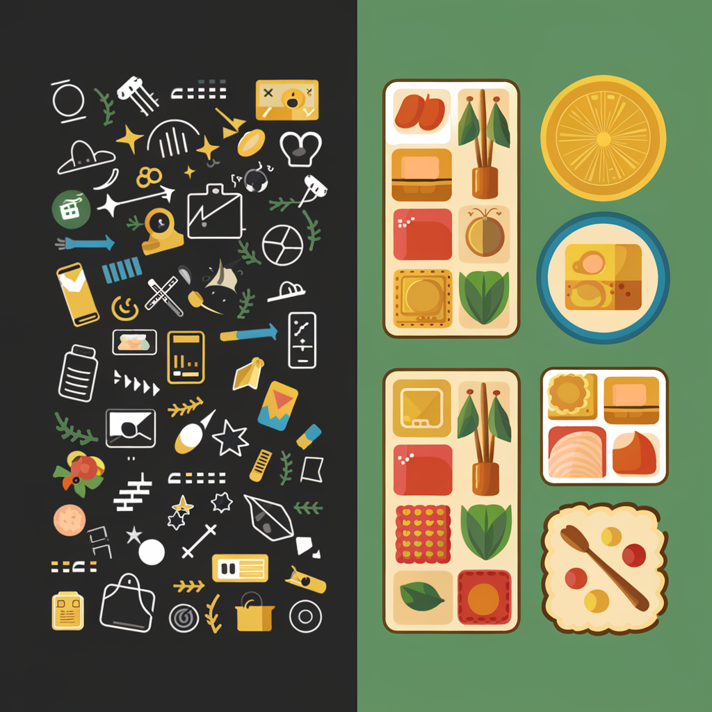
Imagine a traditional Japanese bento – a beautifully packed lunch where each component has its place. Every piece of food is not only appetizing but also arranged to create an aesthetically pleasing composition. This bento approach can be transferred to the user interface (UI) design world, creating “packaged” content that is easy to perceive and looks harmonious.
In today’s world, where information overload is becoming the norm, the Bento approach to UI helps create interfaces that are aesthetically pleasing and function effectively. Let’s explore how the principles of bento boxes can be applied to interface design and the benefits they provide.

Principles of the Bento Approach in UI
- Content Organization Just like in a bento box where each component has its place, in UI, it’s important to structure content so users can easily find the information they need. Organization can include clear division into sections, the use of modular grids, and the highlighting of key elements. For example, in a mobile app, each screen should be structured with intuitive navigation.
- Visual Harmony Colors, shapes, and fonts should harmoniously combine to create an attractive composition. The Bento approach encourages the use of repeating design elements, which helps create cohesion and consistency in the interface. This can be achieved through a limited color palette and consistent typographic styles.
- Simplicity and Functionality Like in a bento, each element of the interface should have its clear function. It’s important to avoid over-complication and ensure that each element is useful and understandable for the user. From minimalist buttons to intuitive navigation – everything should be in its place and easily accessible.
- Interactivity and Responsiveness The UI should respond to user actions, like the ingredients of a bento box combining to create a cohesive taste. Interactivity in the interface helps users feel in control of the interaction, and quick responsiveness creates a sense of intuitive user experience.

Benefits of the Bento Approach
- Improved User Experience: With clear organization and attractive design, users can navigate the interface faster and find what they need.
- Effective Communication: Visual harmony and consistency help better convey key messages and product highlights.
- Reduced Cognitive Load: Clear structure and simplicity allow users to absorb information and make decisions faster.
How to Implement the Bento Approach in Your Design?
- Use Grids and Templates: Start with a clear grid or template to organize content. This will help create a structured and consistent design.
- Choose a Limited Color Palette: Use a limited number of colors to create a harmonious visual experience.
- Focus on Functionality: Remember that each element should have a purpose and be useful to the user.
- Test with Users: Ensure your interface is easy to understand and use by conducting regular testing with real users.
The Bento approach to UI is more than just aesthetics. It’s a way of organizing content and functionality so that they are convenient, attractive, and understandable for users. By using this approach, you can create interfaces that not only look great but also provide an excellent user experience.
If you are ready to try the Bento approach in your next project, our creative digital agency is always ready to help bring these ideas to life. Contact us today, and together we will create something unique!
 1228
1228