Technotara Logo & Branding
Logo & Branding
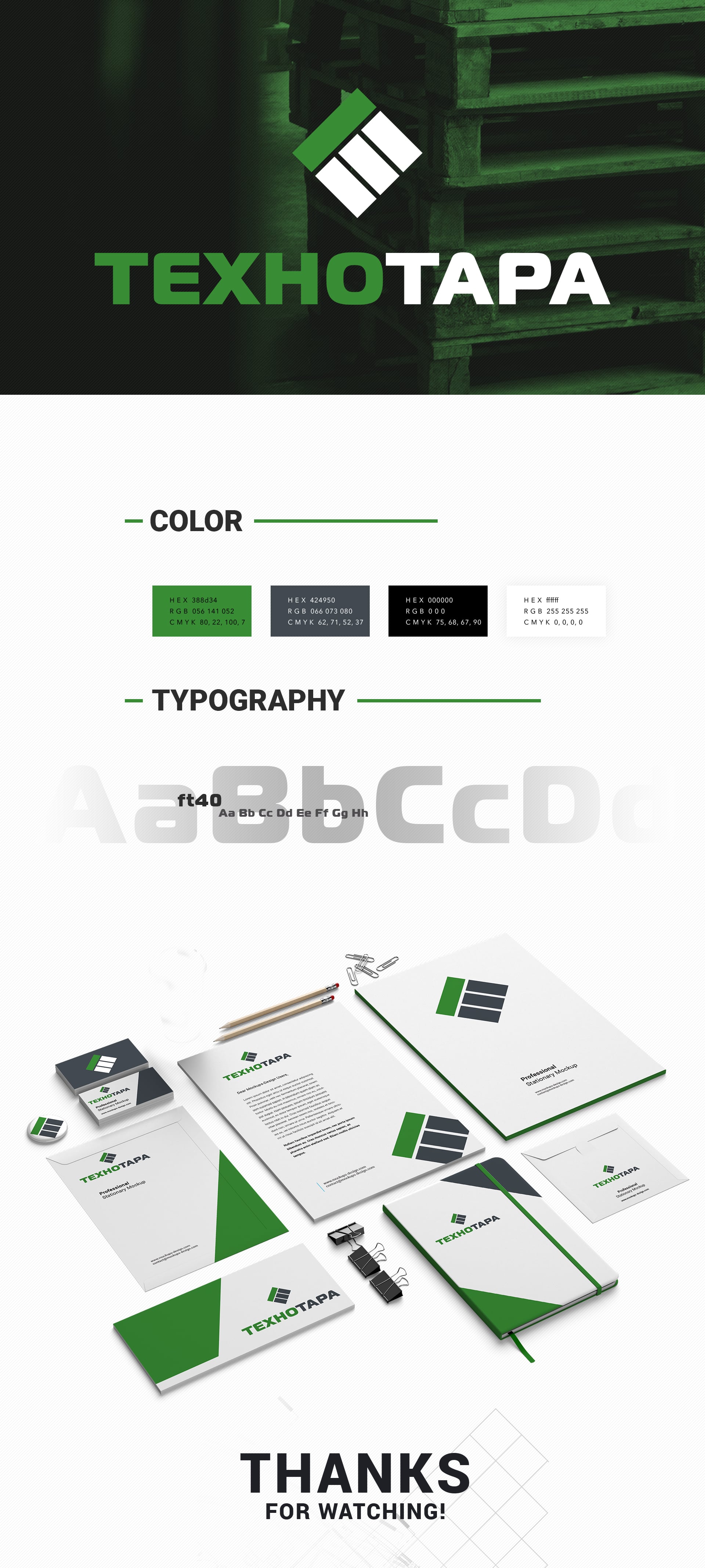
The logo and corporate identity project for an enterprise-manufacturer of containers and packaging. The clear geometric shape of the logo directly indicates the basic qualities of the customer’s products. The square is subconsciously perceived by the viewer as something literal, solid, real. The use of the logo also points out the desire to combine visual images of stability (text) and dynamics (the square on the edge is an unstable figure, and the viewer subconsciously expects it to get into the horizontal position). The overall sense of strength is complemented by powerful typography and color accents. Deep green is associated with reliability. The first letter of the name of the company is successfully inscribed in the form, which, along with the division of the square into segments, adds additional meaning to a simple logo.
