Irina Rogers Logo & Branding
Logo & Branding
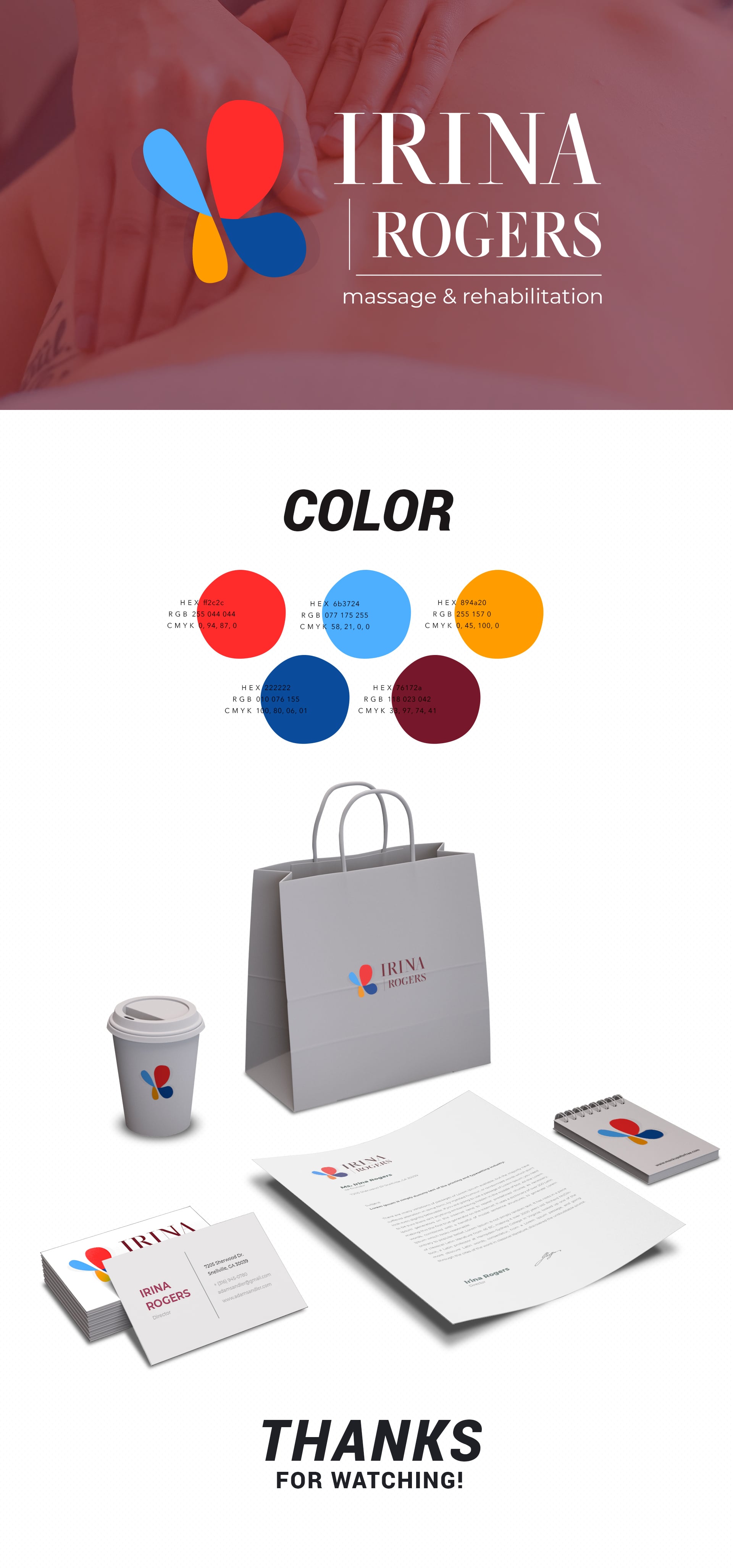
The development of a logo and corporate identity for a massage-rehabilitologist has turned into an optimistic project with a deep meaning. A multi-colored butterfly, an outwardly simple symbol, can have numerous meanings, among them a feeling of lightness as a result of massage, and the hands of the massage therapist, weightless, like wings. The main difficulty that the designer overcame successfully was to pick up a font that would look equally good in three language options of the logo. The project keeps spirits up and also attracts with a colorful palette of cheerful colors; it looks bright on business cards of our design, advertising and souvenir products.
